
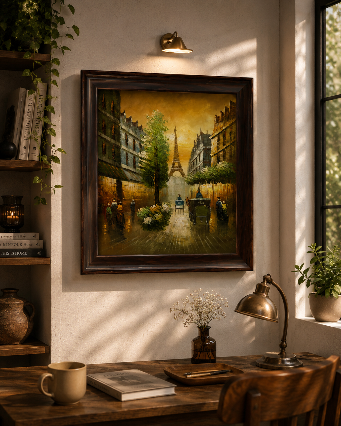
Why Paris Wall Art Never Goes Out of Style
There are very few themes in interior design that feel as effortlessly romantic as Paris. A tree-lined boulevard glowing in the evening light, a flower-covered balcony above a quiet cafe, the Eiffel Tower rising softly in the distance: these scenes carry a sense of nostalgia and calm that people want to live with every day. That is exactly why Paris wall art continues to be one of the most loved choices for living rooms, bedrooms, hallways and home offices.
The good news is that you do not need a large budget or a professional designer to bring this look home. With a little planning, a few well-chosen framed pieces can turn a plain wall into a focal point. In this guide we walk through how to choose Parisian prints, how to think about frames and colours, how to arrange a gallery wall step by step, and where each style looks best. We also highlight a few pieces from the Bauble Homes Wall Charm collection so you can see how different moods, from golden hour to rainy amber, work in real rooms.
Choose the Mood First: Golden, Amber, Pastel or Monochrome
Before you think about frames or layouts, decide what feeling you want the wall to create. Paris art tends to fall into a few distinct moods, and each one suits a different kind of room.
Golden hour and warm light
Artwork bathed in soft golden light feels welcoming and cosy. It suits living rooms and dining areas, especially where you already have warm wood, brass or cream upholstery. The glow in the picture seems to extend into the room, particularly in the evening when your lamps are on.
Rainy amber and autumn tones
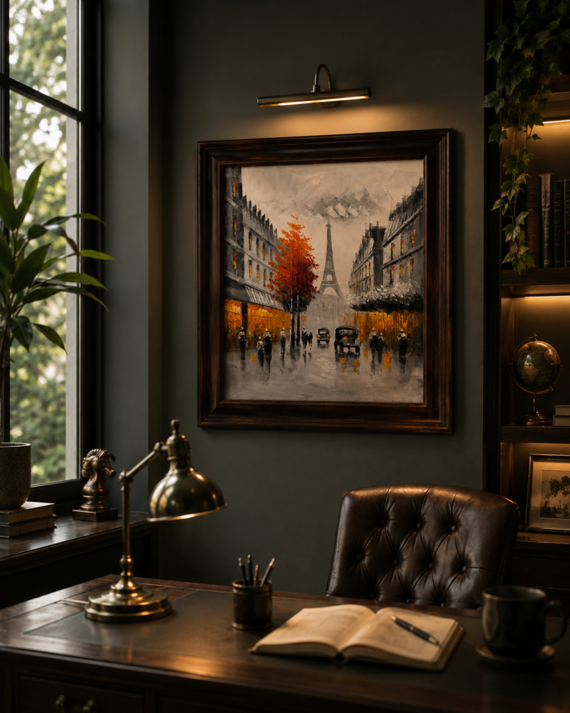
Rain-kissed streets, autumn trees and glowing shopfronts create a richer, moodier atmosphere. These pieces work well in studies, libraries and bedrooms, where you want a slightly dramatic, old-world feel. They also look excellent against deeper wall colours such as olive, navy or warm taupe.
Soft pastels and flower-filled balconies
Pastel artwork with pink blooms, tiny cafe tables and gentle blues feels fresh and light. It is a perfect match for bedrooms, dressing areas and bright breakfast corners, and it pairs beautifully with white walls, linen and pale wood.
Monochrome and black-and-white
Monochrome art is the easiest to blend with any palette. If your room already has a lot of colour in the sofa, rugs and cushions, a monochrome cityscape adds structure and sophistication without competing. It also works wonderfully in modern and minimalist homes.
Frames and Matting: The Details That Make Art Look Expensive
A print in a good frame instantly looks more valuable. When you choose your pieces, pay attention to the frame finish and the space between the artwork and the frame edge, known as the mat or matting.
- Dark wood frames bring depth and an old-world feel. They look particularly striking with warm amber and autumn scenes.
- Light-toned wood frames feel airy and coastal, and pair well with monochrome harbour or cityscape prints.
- Weathered or painted frames, such as a soft aqua-blue, add a vintage, European character and are ideal for pastel pieces.
- Generous matting gives the artwork breathing room and makes even a modest-sized print feel like a gallery piece.
If you are building a wall from several pieces, try to repeat one element, such as the frame finish or the colour temperature, so that the group feels connected even when the scenes are different.
Our Favourite Parisian and City Wall Art Pieces
These are some of the framed pieces from our collection that show how varied the Paris theme can be.
The Parisian Promenade: the golden boulevard
The Parisian Promenade captures the timeless charm of Paris with an atmospheric scene of a classic Parisian boulevard bathed in warm golden light, with the Eiffel Tower standing gracefully in the distance. Vintage carriages, tree-lined streets and glowing architectural details create a scene filled with warmth and nostalgia. It is a natural centrepiece for a living room wall above a sofa or a console.
Paris in Amber: the rainy amber evening
Paris in Amber paints a rain-kissed Parisian boulevard with the Eiffel Tower rising in the distance, framed by autumn trees, glowing shopfronts, vintage cars and softly reflected city lights. The rich dark wooden frame complements the warm amber and earthy tones, giving the piece a sophisticated old-world character. It looks especially good in a study, a dining room or above a bedroom headboard.

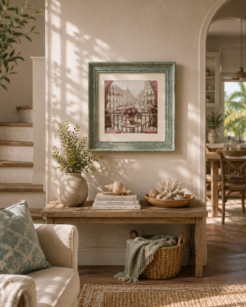
A Morning in Paris: a morning on the balcony
A Morning in Paris is a beautifully illustrated scene of an elegant city street viewed from a flower-filled balcony, complete with charming cafe seating, delicate pink blooms and a quiet table set for coffee and pastries. The softly weathered aqua-blue frame adds a beautifully aged, European character, while the pastel artwork brings warmth and romance. It is perfect for a bedroom, a reading corner or a breakfast nook.
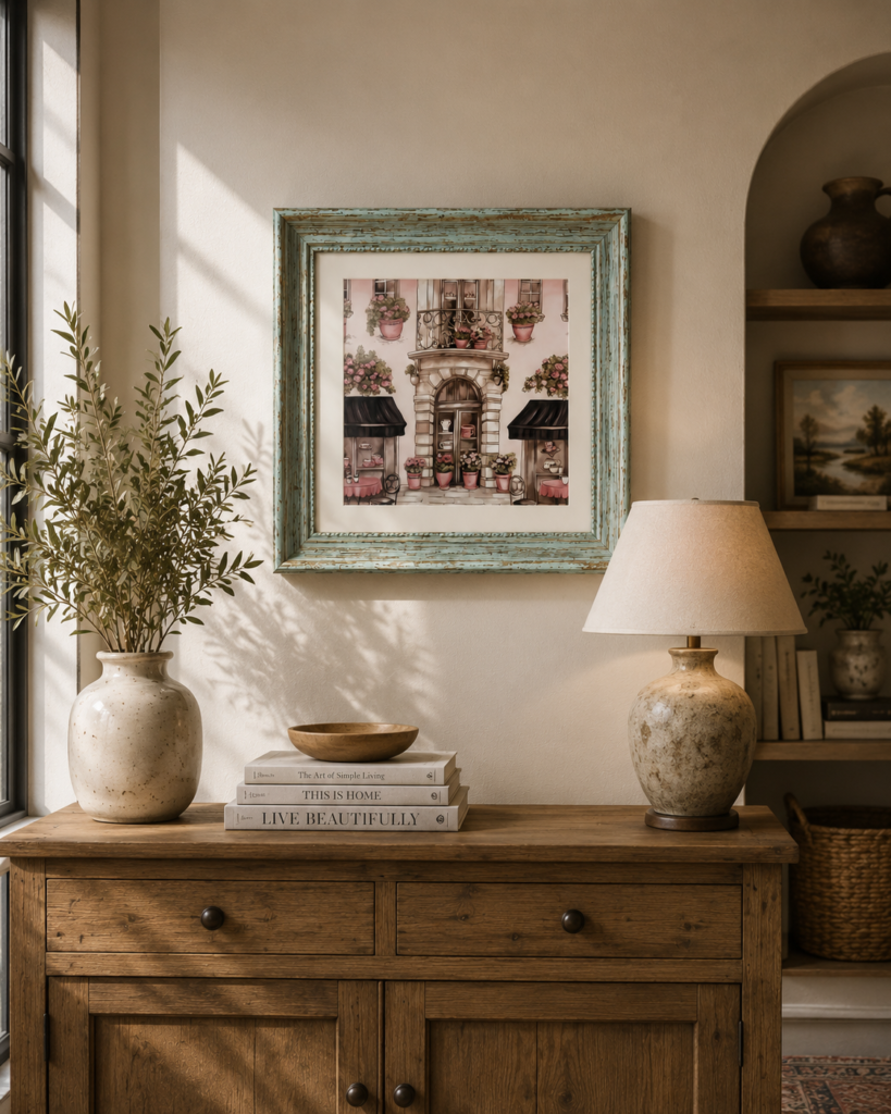
The Little Parisian Café: a quaint cafe front
The Little Parisian Café is a delicate illustration of a quaint Parisian storefront adorned with overflowing flower pots, charming balconies and intimate cafe details. It creates the feeling of a peaceful afternoon on a picturesque European street and works nicely in kitchens, dining areas and hallways.
London Noir and Harbour Memories: city and harbour in monochrome
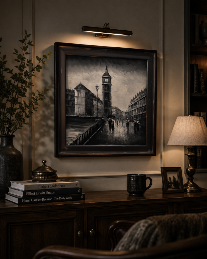
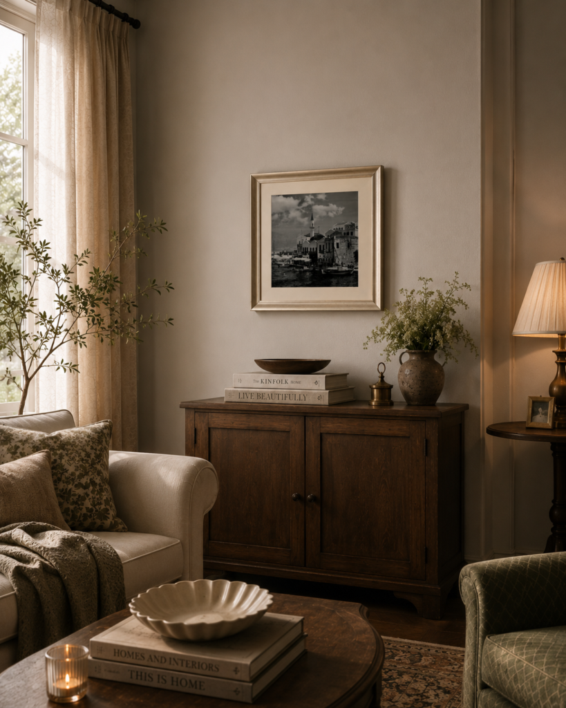
If you prefer a quieter palette, London Noir features the iconic Big Ben rising above a quiet city street beneath a dramatic, cloudy sky, with a monochromatic palette, wet-street reflections and vintage architectural details. Harbour Memories shows a beautifully detailed monochrome harbour scene with boats, historic architecture and a peaceful waterfront, finished with a light-toned wooden frame and generous inner matting. Both are excellent companions to a Paris print because the shared black-and-white tones make the wall feel cohesive.
How to Plan a Gallery Wall in Six Steps
- Measure the wall and the furniture. The artwork should relate to the piece underneath it. As a rule of thumb, the group should be about two thirds the width of the sofa, console or bed it sits above.
- Lay it out on the floor first. Arrange your frames on the floor or on a large sheet of paper until the composition feels balanced. Take a photo so you can refer back to it.
- Decide on the centre line. Aim to have the visual centre of the arrangement at roughly eye level, which is often around 145 to 150 centimetres from the floor.
- Keep spacing consistent. A gap of roughly 5 to 8 centimetres between frames looks tidy and intentional.
- Mix sizes but repeat a theme. One larger piece with two or three smaller ones is easier to balance than four identical frames.
- Hang, step back, adjust. Use a spirit level, hang the anchor piece first and build outwards.
Popular Gallery Wall Layouts
The grid
Frames of the same size arranged in evenly spaced rows create a clean, formal look. It works well in modern rooms and is a good choice if you own several matching prints.
The salon-style wall
A mixture of sizes and orientations, hung close together, creates a collected, gallery-like feel. This is perfect for a hallway, a staircase or a large living room wall.
The single statement piece
If you have a large, striking print, let it stand alone. Position it above a console or a sofa, and add a lamp and a small plant to soften the setting.
The ladder or shelf arrangement
Instead of hanging everything, rest frames on a narrow picture ledge and overlap them slightly. This makes it easy to swap pieces and add small objects, and it suits renters who prefer fewer holes in the wall.
Which Wall Colour Works With Paris Wall Art?
Most Parisian prints have warm neutrals in the artwork, so they look wonderful on cream, ivory, soft beige and warm grey walls. Deeper colours can also look striking: olive green, deep navy and dusty terracotta all make golden and amber artwork glow. If your walls are pure white, choose a frame with some warmth, such as walnut or gold, so the artwork does not look stark.
Where to Hang Paris Wall Art in Your Home
- Living room: above the sofa or a sideboard. Choose one large piece or a balanced group.
- Bedroom: above the bed or on a dressing-area wall. Softer, pastel pieces create a calm mood.
- Dining area: café scenes and warm evening streets suit the theme of gathering and conversation.
- Entryway or hallway: a small salon-style arrangement makes a narrow space feel intentional.
- Home office: a monochrome or amber piece adds character without being distracting.
Styling Ideas That Complete the Look
Art on the wall looks best when the space around it feels connected. Place a table lamp below to add a warm glow, a vase with dried or fresh flowers to soften the console, and a small stack of books to add height. A round mirror on the same wall can bounce light back into the room. Keep the palette warm and natural, and mix in wood, linen and a few blue-and-white accents for a relaxed French-inspired feel.
Common Mistakes to Avoid
- Hanging too high. The most common mistake is placing art near the ceiling. Keep the centre of the group near eye level.
- Using frames that all clash. Mixing is fine, but too many different finishes can look chaotic.
- Leaving large gaps. Keep frames close enough that they read as one composition.
- Ignoring the light. Avoid hanging art in direct, harsh sunlight, which can fade colours over time.
- Skipping the anchor. Use a spirit level and proper wall fixings for heavier frames so they hang safely.
Caring for Framed Wall Art
Dust the frame regularly with a soft, dry cloth and avoid spraying cleaning liquids directly onto the artwork. Keep framed pieces away from damp walls and direct sunlight, and check the fixings every so often to make sure the frame remains secure. If you rearrange the room, lift frames with two hands rather than by one corner.
Frequently Asked Questions About Paris Wall Art
Can Paris wall art work in a modern home?
Yes. A monochrome or amber piece with a clean frame looks striking against modern furniture. The contrast between a romantic scene and a minimalist room is what makes it interesting.
How many pieces should I hang together?
One large piece, three pieces or five pieces are all safe choices. Odd numbers tend to feel more natural, but a symmetrical pair works well above a bed or a sofa.
Should the frames match the furniture?
They do not have to match exactly, but it helps to echo one tone, such as the wood of your table or the metal of your lamp.
Are framed pieces a good gift?
They are a lovely housewarming or anniversary gift, especially for people who love travel, cafe culture or vintage style.
Bring a Little Paris Home
Paris wall art gives you a quiet way to travel without leaving the house. Choose the mood that matches your room, plan your layout, and hang it at the right height, and the wall will start to feel like the heart of the space. Explore the full Wall Charm collection at Bauble Homes to find framed pieces, planters and plates that suit your home.